Though I'm new to the forum, I've been an Apple user for over 23 years...until iOS 7 never felt the need to make suggestions.
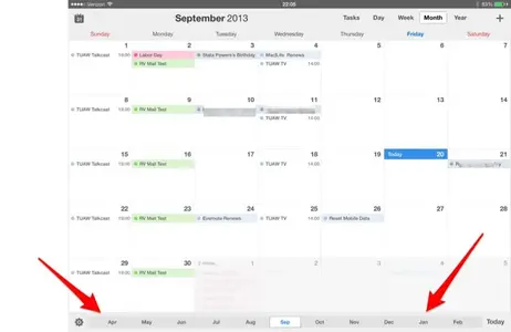
The old calendar had links to every month in a year at the bottom. This was great for creating/editing appointments months down the road. That is gone. Now I have to constantly scroll to view a month...or change the view. So now the ease of use that has always been an Apple trademark has disappeared. I'm back to having to use multiple clicks vs. my one. This is just like an Android and is one of the main reasons I've been an Apple user for so long. Can you go back to product development and see if they can fix this please?
The old calendar had links to every month in a year at the bottom. This was great for creating/editing appointments months down the road. That is gone. Now I have to constantly scroll to view a month...or change the view. So now the ease of use that has always been an Apple trademark has disappeared. I'm back to having to use multiple clicks vs. my one. This is just like an Android and is one of the main reasons I've been an Apple user for so long. Can you go back to product development and see if they can fix this please?


