What's new
Apple iPad Forum 🍎

Welcome to the Apple iPad Forum, your one stop source for all things iPad. Register a free account today to become a member! Once signed in, you'll be able to participate on this site by adding your own topics and posts, as well as connect with other members through your own private inbox!

Numbers (iPad/iPhone) Graph Axis Formatting

kkovak

iPF Noob
Joined
Oct 23, 2011
Messages
2
Reaction score
0
I need to display the x axis of a graph as a date format, e.g.: 1/9/2012. I have set the x axis "number format" to the "same as source". The column where the x axis data is formatted as a date format and displays as 1/9/2012. However the graph shows the x axis values as large numbers, e.g.: 340000000.

Can anyone help me turn it to the required date format?

Thanks
Ken
 
I can't guess at what is going on without more info. I'm just not familiar enough with the chart settings to do it by remote guess.


If there is no personal or privileged information in the spreadsheet, I'd be happy to look at it. You'll need at least one more post before you can offer a link or attachment.
 
I have same problem, big numbers instead of dates.
Also want to add several lines to this simple scatter chart but seem to be limited to one series.
 
Just checked it out, and works perfectly for me...


image-2023955876.jpg

(Unfortunately in German...)

Are you sure you have the date formatted correctly??

☠ stay safe ☠ stay legal ☠
 
Thanks for pic.
Thought your point about formatting had given me the answer. Although data was formatted to date, I had the header title in first cell of the column. Moved the column title into the top shaded bit and formatted the whole column to date, now cannot get anything to show on bottom axis.
Looking at help stuff, they show some toolbars at the very top, including an "insert chart" button, but cannot find how to show this and now see in your example that you do not have these toolbars either.
My data consists of a column of dates and one of blood pressure, the dates are not concurrent so from my excel experience this requires a scatter chart, otherwise dates are treated simply as labels and not values. Would be useful if you could send me a copy of a working chart, but forum will not let me post my address until I have 3 posts, so maybe next time.
I have used Excel for many years and after a lot of hard work have come to understand lots of stuff about the wide range of charts, so feeling very frustrated that I have to start all over again and without and USEFUL help or manual.
 
Pauljoanss said:
Thanks for pic.
Thought your point about formatting had given me the answer. Although data was formatted to date, I had the header title in first cell of the column. Moved the column title into the top shaded bit and formatted the whole column to date, now cannot get anything to show on bottom axis.
Looking at help stuff, they show some toolbars at the very top, including an "insert chart" button, but cannot find how to show this and now see in your example that you do not have these toolbars either.
My data consists of a column of dates and one of blood pressure, the dates are not concurrent so from my excel experience this requires a scatter chart, otherwise dates are treated simply as labels and not values. Would be useful if you could send me a copy of a working chart, but forum will not let me post my address until I have 3 posts, so maybe next time.
I have used Excel for many years and after a lot of hard work have come to understand lots of stuff about the wide range of charts, so feeling very frustrated that I have to start all over again and without and USEFUL help or manual.

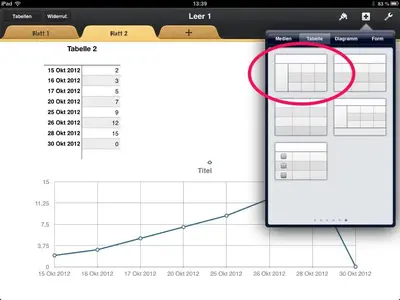
No need for a scatter chart. Just make sure you choose the correct table where you are going to insert the data - see pic:


image-1656774285.jpg

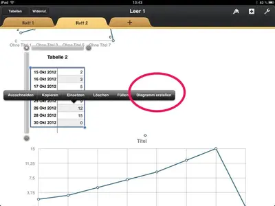
Select the data and the menu will pop up


image-4231510844.jpg

Hope this helps,

☠ stay safe ☠ stay legal ☠
 

Most reactions

Latest posts

Back
Top