What's new

Wife hates ios 7

I thought I was being the good guy when I updated her operationing system. BIG mistake.
Due to corneal damage she cannot get glasses of any sort to help her reading. Those medium blue icons and text are not legible to her. i've already increased the font size, Bold, birghtness,contrast, button shapes, etc. When I tried to revert back to the previous operating system, I was told it cannot be done!
GRRRRRRR
Anyone have a work around? I may have to buy her a used Ipad2 to solve this.
 
Try this if you haven't already-
Settings-General-Accessibility-Invert colours.
 
Last edited:
Thanks

Boy does that increase the contast! Unfortunately it also reviews every photo; eek.
She is really a technophobe so she wants it like it was. I have to keep trying.
I guess this is Steve Jobs reaching out from the grave and messing with my life.
 
Boy does that increase the contast! Unfortunately it also reviews every photo; eek.
She is really a technophobe so she wants it like it was. I have to keep trying.
I guess this is Steve Jobs reaching out from the grave and messing with my life.
Sorry that didn't help, keep logging into the thread though, we have some very helpful staff and members so someone may come up with something.
 
I thought I was being the good guy when I updated her operationing system. BIG mistake. Due to corneal damage she cannot get glasses of any sort to help her reading. Those medium blue icons and text are not legible to her. i've already increased the font size, Bold, birghtness,contrast, button shapes, etc. When I tried to revert back to the previous operating system, I was told it cannot be done! GRRRRRRR Anyone have a work around? I may have to buy her a used Ipad2 to solve this.

Can you please tell me what you mean by 'those medium blue icons'? I could not quite understand.

However, you can go to Settings > Accessibility > Increase contrast, and toggle the options there, to see if it helps or not. If it does not, then I will be waiting for your explanation regarding the blue icons.

Please post back of this helps. Good luck!

I think maybe the icons that appear after an app is updated.
 
I think maybe the icons that appear after an app is updated.

A darker wallpaper will help a great deal with this, I had to do this to see them. Apple should really switch to a high-contrast app icon overlay for this.. it would help regardless of the wallpaper being used.
 
Last edited:
A darker wallpaper will help a great deal with this, I had to do this to see them. Apple should really switch to a high-contrast app icon overlay for this.. it would help regardless of the wallpaper being used.

Totally. Maybe also make the UI of the photo app black. Its painful to the eyes to look at it.
 
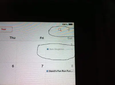
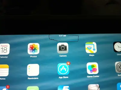
Why she hates IOS 7.

photo(2).webpphoto(3).webpphoto(4).webpphoto(20).webp
Even with $700 glasses she can no longer recognize these symbols. With IOS 6 she could! The skinny blue lines are a bad joke.
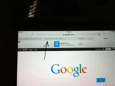
Who dreamed up these 'improvements'? They should be fired. Also on the Google display we used to be able to close
other windows without maximizing them first.
Also, the TINY circle with the X inside to close is now so small and LOW contrast it is almost invisible.
Androids here we come!
 
<img src="http://www.ipadforums.net/attachment.php?attachmentid=54329"/><img src="http://www.ipadforums.net/attachment.php?attachmentid=54330"/><img src="http://www.ipadforums.net/attachment.php?attachmentid=54331"/><img src="http://www.ipadforums.net/attachment.php?attachmentid=54332"/> Even with $700 glasses she can no longer recognize these symbols. With IOS 6 she could! The skinny blue lines are a bad joke. Who dreamed up these 'improvements'? They should be fired. Also on the Google display we used to be able to close other windows without maximizing them first. Also, the TINY circle with the X inside to close is now so small and LOW contrast it is almost invisible. Androids here we come!

Well, to get a white on black text in Safari, all you can do is turn private browsing on, but then, all the websites that you browse will NOT be stored in your history.
 
I also have Fuchs dystrophy corneal des ease and find any print in blue very difficult to read. Why did they change to paler blue.I also find some screens more misty since the updates and the latest update yesterday made the keyboard different but pass code freezes also
 
I also have Fuchs dystrophy corneal des ease and find any print in blue very difficult to read. Why did they change to paler blue.I also find some screens more misty since the updates and the latest update yesterday made the keyboard different but pass code freezes also

I feel sad for you guys, not being able to take full advantage of this wonderful machine...

All you can do to make the text white on black in Safari ONLY, as I said, is turn private browsing on. Yes, iOS 7 has some misty parts, so they look like that not only to you but to all of us m
 
I must say i have trouble reading the text in the Blue bubble in iMessage, I have an eye condition (two actually) and Blue is the worst colour for me even on my Macbook, I hope in the future we get the option to change the colours in iMessage.
 

Most reactions

Latest posts

Back
Top