What's new

Anyone else HUGELY disgusted by the flat look?

Thats exactly what upsets me, that it is considered better :[ Despite sounding completely superficial, the iPhone did win me over not only because of the phone itself, but because the OS was superior to all other in the way it looks, specifically the keyboard, I will miss it greatly. I will most probably upgrade my iPhone to iOS 7, because the features are definitely worth it. Granted I wont "love" it as much because it will pain me to look at iOS 7.

Im just curious to see how it will appear on the iPad. On the iphone, it can be understandable. People want a "simple" interphase (although I thought it was simple before), and it makes sense to put it on a phone. But to have that look on the beautiful ipad will just be blah. It upsets me that apple is conforming. :[

Below are some thumbnails of how iOS 7 will look on iPad, taken directly from Apple's website:
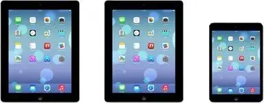
image.webp

I don't understand why you are saying that Apple is conforming. The design of iOS 7 definitively is nothing like Windows Mobile. That isn't an opinion, that's a fact. I mean, honestly, compare screenshots of the two below:
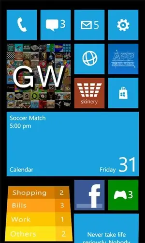
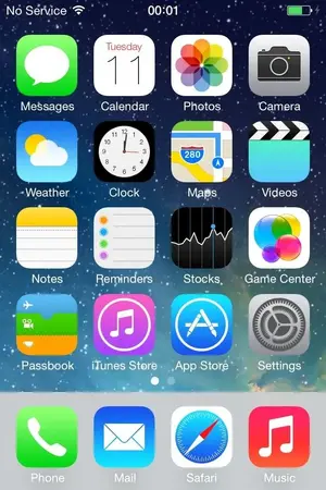
image.webp image.webp

How can anyone say that these two look even remotely similar, or, for that matter, that Apple are conforming to a style of design set by Microsoft? And, having used Android on more than one device, I can safely say that I've never seen any stock version of Android that looks anything like iOS 7.

I apologise if I sound angsty, but I'm sick of people spewing out "facts" without backing them up. Of course, everyone is entitled to their opinion, but what are essentially bare-faced lies are not acceptable.
 
Last edited:
Everybody....it is time to all take a step back and BREATHE a little, please!

Everybody's opinion counts so please do respect that!

Thank you,
Ski ~
iPadforums Moderator | iPhoneForums Moderator
 
I think the new design reminds me a lot of the android phones. I'm not crazy about the look, but nothing I would really get upset over. As long as my phone works, and doesn't get complicated, I'm good.
 
Below are some thumbnails of how iOS 7 will look on iPad, taken directly from Apple's website:

View attachment 43224

I don't understand why you are saying that Apple is conforming. The design of iOS 7 definitively is nothing like Windows Mobile. That isn't an opinion, that's a fact. I mean, honestly, compare screenshots of the two below:

View attachment 43225 View attachment 43226

How can anyone say that these two look even remotely similar, or, for that matter, that Apple are conforming to a style of design set by Microsoft? And, having used Android on more than one device, I can safely say that I've never seen any stock version of Android that looks anything like iOS 7.

I apologise if I sound angsty, but I'm sick of people spewing out "facts" without backing them up. Of course, everyone is entitled to their opinion, but what are essentially bare-faced lies are not acceptable.

I really wouldn't call iOS 7 "flat" as it still has some gradients in the icons. A gradient is a way of making it appear that light is shining across a curved surface and many of the icons, as well as the dock, have such gradients. Compare that with the Windows screenshots.

I quite like the appearance of iOS 7, it's a "clean" look and dropping some of the UI effects will no doubt result in a faster user interface - which was likely one of the reasons that mobile operating systems are headed in this direction.
 
Last edited:
Below are some thumbnails of how iOS 7 will look on iPad, taken directly from Apple's website:

<img src="http://www.ipadforums.net/attachment.php?attachmentid=43224"/>

I don't understand why you are saying that Apple is conforming. The design of iOS 7 definitively is nothing like Windows Mobile. That isn't an opinion, that's a fact. I mean, honestly, compare screenshots of the two below:

<img src="http://www.ipadforums.net/attachment.php?attachmentid=43225"/> <img src="http://www.ipadforums.net/attachment.php?attachmentid=43226"/>

How can anyone say that these two look even remotely similar, or, for that matter, that Apple are conforming to a style of design set by Microsoft? And, having used Android on more than one device, I can safely say that I've never seen any stock version of Android that looks anything like iOS 7.

I apologise if I sound angsty, but I'm sick of people spewing out "facts" without backing them up. Of course, everyone is entitled to their opinion, but what are essentially bare-faced lies are not acceptable.

Its funny how youre focusing this on microsoft, i never said they are conforming to a style based on them, more of conforming to the styles used by them and mainly android. microsoft is a small part of this. Im not spewing out any facts anywhere, Im merely stating this design resembles android and windows 8 UIs. I go into music, safari, mail, even messages, they all remind me of android. It's no fact, it's what I see.
 
I like the new look and welcome the improvements, but still find many of the icons ugly.
What is disturbing is their tonal balance.

Particular ugly ones are Safari, Camera and Settings....
Let's hope they tweak them before release, but I'm not too optimistic.
 
I welcome the new look, features, and functionality Apple has implemented.

Well needed and about time IMO. I actually like the new icons. I usually jailbroke my iPhone and iPad, just so I could change the theme to something "flat" like this.

I can honestly say, with the call blocking features (for iPhone), control center, better multitasking, panorama effects, plus those damn icons ;), ill no longer jailbreak my iDevices. Unless the jailbreak community spits out something that is just a must have *cough*. :rolleyes:

I like this look too, it reminds me of the MIUI rom that I always flashed on my android devices. This was the only reason I rooted my android devices.
 
This is what you see when you swipe up from any screen you're on.

image-1199525692.webp here are the media player controls as well as some if the more important features from settings, like Airplane mode, do not disturb, etc. If you notice, there's now a built in flashlight app, no need to download a separate app.
 
This is what you see when you swipe up from any screen you're on.

View attachment 43236 here are the media player controls as well as some if the more important features from settings, like Airplane mode, do not disturb, etc. If you notice, there's now a built in flashlight app, no need to download a separate app.

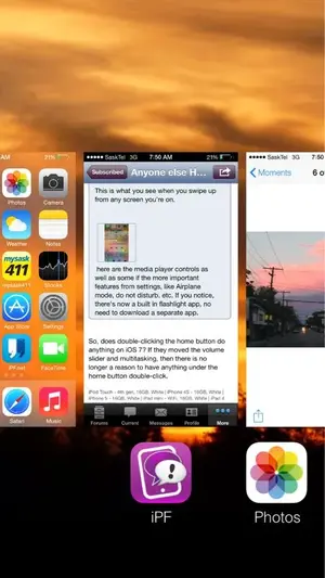
So, does double-clicking the home button do anything on iOS 7? If they moved the volume slider and multitasking, then there is no longer a reason to have anything under the home button double-click.
 
i'm not sure yet about the "flat" look of the icons,i think though that after a while you just forget what things looked like before and it becomes familiar.
 
So, does double-clicking the home button do anything on iOS 7? If they moved the volume slider and multitasking, then there is no longer a reason to have anything under the home button double-click.
Yes, it still brings up the Multi tasking bar, with the screen associated with the icon directly above it when the icon is at centre screen. Swipe the screens from right or left and tap on the one you want. The screen opens up the app, just where you left off. image-3949331875.webp
 
Last edited:

Most reactions

Latest posts

Back
Top