What's new
Apple iPad Forum 🍎

Welcome to the Apple iPad Forum, your one stop source for all things iPad. Register a free account today to become a member! Once signed in, you'll be able to participate on this site by adding your own topics and posts, as well as connect with other members through your own private inbox!

Axis labels in "Numbers"

eatlynnow

iPF Noob
Joined
Nov 22, 2012
Messages
1
Reaction score
0
I am creating a time column spreadsheet in Numbers. The data is in the secnd column. What should appear as the "X" axis values are in the first column. When I create the chart I find no way to have Number recognize the first column as the "X" values.

When I go to the tutorial included with Numbers you can select the data and the "X" values are automatically included. What gives?
 
Labels are automatically created from the header columns. There is no way to assign other columns or rows.

To make the first column a header:

Select the table by tapping on it somewhere.
Tap the Paint Brush icon.
Tap the Headers tab.
Change the Header Column to 1

Freeze Column will make sure that the header column will stay visible as long as the table is visible (when scrolling)
 
Hi and welcome to the Forum!

The IPad Forum is a community of members from all walks of life and from all over the world coming together to share our experiences and to help each other learn about this wonderful piece of technology the Ipad. There is a wealth of information already here in the many threads we have so doing some searches will answer most of the questions you have. If then you cannot find the answer you are seeking then by all means post your question. There are many friendly and informed members here only too willing to help you.

We also have our own App - It is a very simple app to navigate.
http://itunes.apple.com/us/app/discussion-forum-for-ipad/id412896524?mt=8
Tutorial on creating posts on the Forum
http://www.ipadforums.net/new-membe...-creating-posts-starting-new-threads-how.html
Reading the IPad manual is a great place to start so please download a copy of these.
http://www.support.apple.com/manuals/ipad/
3 very informative threads from which you will learn many tips and shortcuts for the IPad.
http://www.ipadforums.net/ipad-general-discussions/21590-tips-tricks-those-us-who-dont-know.html
http://www.ipadforums.net/ipad-os/49581-ios5-tips-tricks.html
http://www.ipadforums.net/ipad-help...shortcuts-helpful-places-people-new-ipad.html
We have rules like any Community so please read these also
http://www.ipadforums.net/forum-rul...um-rules-everybody-please-read.html#post14697

Once again we welcome you here and are so pleased you have joined us!
 
I have the same question and I can't understand your answer.

I have a simple two column chart. In the first column are the 12 months of the year. Second column contains data corresponding to each month. When I call up a 2 axis line chart, the data plots properly but how do I make the first column (months) appear across the bottom as x-axis labels, as they have done in the sample charts.

Larry Cruzen
 
X axis labels

I have the same question. Can't understand that you reply you got. Did you ever figure out how to make the first column become X axis labels as they do in the examples?

Larry Cruzen
 
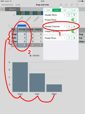
To set a column as labels it must be the left most column and you must have that column set as a Header column.

1. To change the left column to a header column tap something in the table, then select the paint brush icon, then the Header tab. Make sure the Header Column is set to 1. This will usually change the column into a darker background color.

2. Now go back to the table and select the column you want to supply the data points. Do this by tapping the bar above the the table. the entire column will be highlighted and a menu will appear. Choose Create Chart from the menu. Pick the chart type you want.

The left column will now become the labels along the x-axis (the bottom of the chart).
Lables.png

To adjust how the labels are displayed tap the chart to select it, tap paint brush icon, the X-Axis tab, and then the Label Angle.


If you still can't make it work, or this isn't what you were asking for please discribe what you want to accomplish in more detail and I will do my best to explain; assuming it is possible.

Good luck.


Don't forget the ? icon. If you tap it then "Learn more about Numbers" at the lower left of the screen it opens a fairly decent online manual. You can find the same information and a bit more here: http://www.apple.com/support/ios/
 
Last edited:
Really appreciate your detailed response. My problem was that I didn't have the X axis labels in the first column. Got it down pat now. Now if I could just move the legend away from the chart title........

Larry Cruzen
 
It's tricky, but it can be done.

When you tap on the chart to select it you'll notice that the legend has a box around it. You can drag this box just about anywhere you like. Tap and hold the legend for about a second and the selection outline of the chart disappears. Not letting up on the legend, drag it where you want.

The two green dots (left and right) let you resize the legend so that items stack up instead of being all horizontal (if you have more than one data set selected). At it's smallest you end up with a vertical list.


The Title can't be moved. If I don't like the Title placement what I'll do is turn it off in the Chart Options then create my own title using the Text shape, or if i want a bit of color use one of the other shapes and place text inside it.

Good luck.
 

Most reactions

Latest posts

Back
Top