What's new
Apple iPad Forum 🍎

Welcome to the Apple iPad Forum, your one stop source for all things iPad. Register a free account today to become a member! Once signed in, you'll be able to participate on this site by adding your own topics and posts, as well as connect with other members through your own private inbox!

iOS, iPad, Numbers, formatting chart data line presentation

RadioSaigon

iPF Noob
Joined
May 4, 2013
Messages
5
Reaction score
0
Location
Jakarta
Greetings. 1st, the necessary information: iPad Mini, iOS 6.1.3, Numbers for iOS 1.7.2. I believe these are the most recent versions available.

Some time ago I created a spreadsheet with line graphs on my Mac, which I was able to format as I preferred quite easily. Currently my Mac is with my partner some 7-8000 miles away! Yesterday, on my iPad, I added another couple of data ranges to my spreadsheet, which duly appeared within my graph... but the data-line formatting is a clunky and ugly default, it seems. The new data-lines have a rather crude and thick line attribute and "o"'s where the line crosses a graph major intersection. Ugly. I know that I can change those attributes on the Mac very quickly and simply, but the current geographic dislocation rather obviates that in the immediate future. I've spent quite a few fruitless hours searching here and on Google for the answer, but no joy.

Simply stated, I would be very grateful if anyone can tell me how to reduce the line thickness and remove the o on the line intersections -or indeed if that is even possible on iOS.

Many thanks fo any advice, in advance!

Regards

RS
 
I'm afraid you have very limited control over how a graph looks in Numbers on iOS.

Select your chart and go through all the Chart, X, Y, and Arrange controls. That's all you get. Fine control over things like line color, thickness, data points, etc. are not available in iOS Numbers.

All you have are several template/presets to choose from and some control over labels and grids.
 
All you have are several template/presets to choose from and some control over labels and grids.

hmmm... Pretty much as I suspected. Thanks for taking the time to reply! I guess it'll just have to wait until I can get back on my Mac ;-)
 
No problem. I find it slightly frustrating too, as I have a tendency to tweak a graph until it squeals. It's not that the templates are bad, just that I usually have a different idea of how I want the data to look.

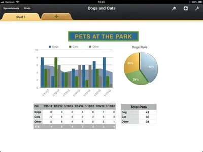
I've had some success with unique graphs by layering them. For instance, I've layered line and block graphs; one on top of the other with some degree of transparency. This lets me display a series of data points with an average line overlaid. It's tricky getting everything lined up, and once I do I lock them so they don't get displaced easily afterwards.
 
Great suggestion, thanks! I'll try that in future when I have an appropriate data set! Not going to work in this instance unfortunately -the data is relatively linear (weight vs speed, aircraft V-speeds) so in this instance, line charts are necessary, and relatively fine control of he line appearance for clarity and readability essential. I'm definitely going to have to explore this whole layering/transparency concept now though... you have me intrigued!
 
Like I said. It's a bit tricky. Both charts need their vertical scale set manually, to avoid future data messing up the relationship. I find it easiest to copy the second chart, remove it's references, then add the ones I want back in. As long as you are careful not to resize the vertical element, things work pretty well. The horizontal size may have to be tweaked a bit for looks. You also need to turn off all labeling and grids for the second chart, to avoid overlap; though it's handy to leave the y-axis labels in place until you've aligned the chart, as a reference point.

I've done similar things with shapes, when I just wanted to establish reference zones, like green, yellow, red; to establish acceptable limits. Getting that lined up right is very tricky.

Here is a nonsense example I made while trying out some of Number's chart features. The data comparison does not make a lot of sense, but the chart looks pretty good.

https://www.box.com/s/4ycmsapbif4ew3mh60gz


image-2491140857.jpg
 
Last edited:
Even I am using ipad mini and for doing the graphical data representation, I use a chart software Koolchart and I find it very useful and compatible for working with charts.You can try it in future.
 

Most reactions

Latest posts

Back
Top