You are using an out of date browser. It may not display this or other websites correctly.
You should upgrade or use an alternative browser.
You should upgrade or use an alternative browser.
Status Bar
- Thread starter douglashh
- Start date
twerppoet
iPad Fan
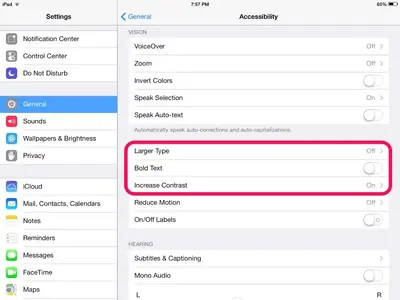
The Bold Text options affects all the system fonts. That's why the iPad reboots. It's not a huge difference, but it's there.
Larger Text is limited to some of the native apps. It won't affect anything on the Home Screen or slide out panels, or status bar.
The best I've been able to figure out so far for Increase Contrast is that it affect the Notification and Control Panels. They will go opaque (or nearly so) with the option turned on. Doesn't seem to affect transparency anywhere else. At least no where that I've checked to date.
Last edited:
ardchoille
iPF Novice
The Bold Text options affects all the system fonts. That's why the iPad reboots. It's not a huge difference, but it's there.
Larger Text is limited to some of the native apps. It won't affect anything on the Home Screen or slide out panels, or status bar.
The best I've been able to figure out so far for Increase Contrast is that it affect the Notification and Control Panels. They will go opaque (or nearly so) with the option turned on. Doesn't seem to affect transparency anywhere else. At least no where that I've checked to date.
Thanks for this. I tried the Increase Contrast option and it made the Notification Center and the Control Center look much better.
twerppoet
iPad Fan
Thanks for this. I tried the Increase Contrast option and it made the Notification Center and the Control Center look much better.
You're welcome. I've decided to leave Increase Contrast off. It looks good with my current wallpaper. In my experience it looks poor with light wallpapers, but that may just be my taste.
ardchoille
iPF Novice
You're welcome. I've decided to leave Increase Contrast off. It looks good with my current wallpaper. In my experience it looks poor with light wallpapers, but that may just be my taste.
No, you're right, it looks bad with light wallpapers.
Most reactions
-
 412
412 -
 313
313 -
 209
209 -
 173
173 -
 134
134 -
 107
107 -
 79
79 -
 20
20 -
 7
7 -
 6
6 -
 5
5 -
 4
4 -
 2
2 -
K
1
Similar threads
- Replies
- 3
- Views
- 4K
- Replies
- 1
- Views
- 5K

