After a dearth of available themes, more and more are being released specifically for the iPad. This trend could seriously start to hurt my bank account!
Anyway. I was browsing through Cydia, looking for something specific I needed for a review I'm writing. And look what I found! This theme was just loaded today (9 July). Without further ado, inPulse for iPad ($1.89, USD):
The lockscreen:

The homepage:

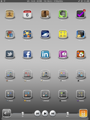
When compard to some of the other themes, this theme is very subtle. In fact, it looks very similar to the stock iPad. However, take a closer look at the icons. Aren't they beautemous? That is some serious detail! I've always like borders on the icons and these are some of the best I've seen. In addtion, the work done to have the mirroring on the dock is first class.
In the theme download are separate Winterboard settings to modify the iPod skin, the springboard, the lock screen, icon shadows and the dock. Just check the parts you want to theme. Several different wallpapers are also added to your iPad's Wallpaper area (though the wallpapers here are ones that I installed). There is also an SBSettings theme that can be applied through SBSettings.
TBH, I do not particularly care for the SBSettings theme. The white print is a bit hard to read and, overall, the whole effect is a little too … um … bright, I guess I'd say. Well here, take a look and judge for yourself:

I didn't keep that SBSettings theme long. I put on my Serious SBSettings theme, which I think looks better (and even blends in quite well with the overall look):

So there you have it. For $1.89, it's a nice, clean and [dare I say] sophisticated look. Who knows how long it'll be before I change it again (yes, changing the looks of my iPad is a hobby…). But, for now, I am very pleased.
Marilyn
Anyway. I was browsing through Cydia, looking for something specific I needed for a review I'm writing. And look what I found! This theme was just loaded today (9 July). Without further ado, inPulse for iPad ($1.89, USD):
The lockscreen:

The homepage:

When compard to some of the other themes, this theme is very subtle. In fact, it looks very similar to the stock iPad. However, take a closer look at the icons. Aren't they beautemous? That is some serious detail! I've always like borders on the icons and these are some of the best I've seen. In addtion, the work done to have the mirroring on the dock is first class.
In the theme download are separate Winterboard settings to modify the iPod skin, the springboard, the lock screen, icon shadows and the dock. Just check the parts you want to theme. Several different wallpapers are also added to your iPad's Wallpaper area (though the wallpapers here are ones that I installed). There is also an SBSettings theme that can be applied through SBSettings.
TBH, I do not particularly care for the SBSettings theme. The white print is a bit hard to read and, overall, the whole effect is a little too … um … bright, I guess I'd say. Well here, take a look and judge for yourself:

I didn't keep that SBSettings theme long. I put on my Serious SBSettings theme, which I think looks better (and even blends in quite well with the overall look):

So there you have it. For $1.89, it's a nice, clean and [dare I say] sophisticated look. Who knows how long it'll be before I change it again (yes, changing the looks of my iPad is a hobby…). But, for now, I am very pleased.
Marilyn
Last edited:


