What's new
Apple iPad Forum 🍎

Welcome to the Apple iPad Forum, your one stop source for all things iPad. Register a free account today to become a member! Once signed in, you'll be able to participate on this site by adding your own topics and posts, as well as connect with other members through your own private inbox!

iOS 7 - first impressions

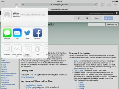
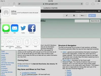
Just did the update via itunes on my mini. First things I noticed: I went from 4.9 Gb free to 6.2 ! There is a hitch when i pinch close an app repainting the icons, maybe 0.1 second, just enough to make it look a little jerky but i did notice this in safari: <img src="http://www.ipadforums.net/attachment.php?attachmentid=48659"/> see how the print icon is sheared off. It's the same in portrait or landscape.

With the print icon, have you trying scrolling left or right to see if it's no longer cut off?
 
I'm sure it's pretty much common sense to swipe left or right, considering you're using a touch screen

Agreed, for past users yes, but for new users? If you look at the camera app there are three modes, video, picture and square, now if you've never used iPads and other such devices before how would you go about changing mode. My first instinct in that case would be to touch the text to switch, do this and nothing happens, you have to swipe up or down to switch mode, but as I said there are no visual cues highlighting this.

When IOS 7 was released there was a glut of questions on how to close an app running in the background, swiping the app window up wasn't intuitive as a lot of existing iPad users were confused by the change.

A few visual hints are required, as these types of question would seem to indicate. iPads are used by the general public, more and more less tech savvy people are now using them so I feel UI designers need to take this into consideration when designing their products.
 
Last edited:
Agreed, for past users yes, but for new users? If you look at the camera app there are three modes, video, picture and square, now if you've never used iPads and other such devices before how would you go about changing mode. My first instinct in that case would be to touch the text to switch, do this and nothing happens, you have to swipe up or down to switch mode, but as I said there are no visual cues highlighting this. When IOS 7 was released there was a glut of questions on how to close an app running in the background, swiping the app window up wasn't intuitive as a lot of existing iPad users were confused by the change. A few visual hints are required, as these types of question would seem to indicate. iPads are used by the general public, more and more less tech savvy people are now using them so I feel UI designers need to take this into consideration when designing their products.

I see where you're coming from, although that's where people's "imagination" should come in to play. That's why there's touch screens with so many possibilities to perform certain operations. People just need to figure some things out for themselves. It sounds harsh, but some people just lack initiative.
 
I tried to make the drop down box bigger....
After all there is no reason to think you can't.
 
Last edited by a moderator:
Agreed, for past users yes, but for new users? If you look at the camera app there are three modes, video, picture and square, now if you've never used iPads and other such devices before how would you go about changing mode. My first instinct in that case would be to touch the text to switch, do this and nothing happens, you have to swipe up or down to switch mode, but as I said there are no visual cues highlighting this.

When IOS 7 was released there was a glut of questions on how to close an app running in the background, swiping the app window up wasn't intuitive as a lot of existing iPad users were confused by the change.

A few visual hints are required, as these types of question would seem to indicate. iPads are used by the general public, more and more less tech savvy people are now using them so I feel UI designers need to take this into consideration when designing their products.

There is a "got you" in settings, the little slide switches for off and on. You can turn them on by swiping to the right, but swiping back to the left won't turn them off. You have to tap them ( you can turn them on by a single tap too)
 
There is a "got you" in settings, the little slide switches for off and on. You can turn them on by swiping to the right, but swiping back to the left won't turn them off. You have to tap them ( you can turn them on by a single tap too)

Funny, if you mean On/Off Labels, and I think you do, it works fine on my iPad the switch slides both ways, it also works by tapping. I don't get the idea of that setting at all though, if a switch is on the background turns green, having a little I or O inside doesn't make it any more legible and I should know I'm visually impaired.

This iteration of IOS seems to be affecting different iPads in different ways. Some people are experiencing slow transitions to home screen when closing apps or safari for instance while I'm not. I wonder if it's related to which generation of iPad the OS is installed.
 
Just did the update via itunes on my mini. First things I noticed:

I went from 4.9 Gb free to 6.2 !
There is a hitch when i pinch close an app repainting the icons, maybe 0.1 second, just enough to make it look a little jerky

but i did notice this in safari:
View attachment 48659

see how the print icon is sheared off. It's the same in portrait or landscape.
I understand what you mean by the jerky pinch closing of an app. Its a brief period when the background changes to black. Right? For me, it happens only while pinch closing Safari.
 
I HATE IOS 7 - both on my iPad 2 & my iPhone. Hate the way the colours have changed - use Notes all the time and I like it yellow, not white! Hate how some of my app icons have changed, the lock code screen has changed - numbers are not in the same spots, can't just type in my lock code like I used to, keep hitting the wrong numbers. Hate the new "control centre". All the instructions are in very, very pale white, and it can barely read them - not at all user friendly. Especially hate Safari - why did they have to change the whole look of the damn thing, and where everything is on it? Thank God I have a teenage niece who's just told me how to close apps (because the old way no longer works) and how to lock/unlock screen rotation on the phone, because I couldn't do that the old way either. I tried to use the link from these forums to preview the new IOS before downloading it, but it wouldn't work unless you had IOS 7 installed! Right now I hate Apple in General, and if you can possibly have a look at someone else's device before you download, I'd strongly advise you to do that.
I'm with you. I really dislike this OS!
 
There is a "got you" in settings, the little slide switches for off and on. You can turn them on by swiping to the right, but swiping back to the left won't turn them off. You have to tap them ( you can turn them on by a single tap too)
For me, sliding both ways works.

Funny, if you mean On/Off Labels, and I think you do, it works fine on my iPad the switch slides both ways, it also works by tapping. I don't get the idea of that setting at all though, if a switch is on the background turns green, having a little I or O inside doesn't make it any more legible and I should know I'm visually impaired.

This iteration of IOS seems to be affecting different iPads in different ways. Some people are experiencing slow transitions to home screen when closing apps or safari for instance while I'm not. I wonder if it's related to which generation of iPad the OS is installed.
iOS 7.0.2 seems to have increased the response rate of my device a bit, though it was too slow on iOS 7.
 
Any of them, like keyboard clicks or lock sounds under sounds I can turn them on 100% of the time sliding, but can at best get them to turn of 10% of the time. Weird.

My mini is only about 2 months old, and I did the upgrade through iTunes ( once I figured out it had to be hooked to the PC by cable, not WiFi) and other than adding some common apps and a lot of PDF's it was in out of the box condition right down to the background. That may be why I'm not seeing any of the problems that others have reported??

After the upgrade I still had the same background, same settings, even had the same 2 pages in 2 tabs in Safari. So far I like it...but I do miss my bookmarks bar in Safari. Now I have to hit the + to start a new tab or kill the existing ones to see them....but I can have a lot more of them so all is good.
 
Just did the update via itunes on my mini. First things I noticed: I went from 4.9 Gb free to 6.2 ! There is a hitch when i pinch close an app repainting the icons, maybe 0.1 second, just enough to make it look a little jerky but i did notice this in safari: <img src="http://www.ipadforums.net/attachment.php?attachmentid=48659"/> see how the print icon is sheared off. It's the same in portrait or landscape.
The print icon is sheared off like that because there is not enough room to display all the icons. Just swipe to the left to slide the icons over and reveal the whole of the print icon.

image-2815790767.jpg


image-3780505484.jpg
 
Last edited:
I understand what you mean by the jerky pinch closing of an app. Its a brief period when the background changes to black. Right? For me, it happens only while pinch closing Safari.

No for me it's like the icons stop about 10 pixels short of the final position then jump to the final positions. But they are smooth when you unlock it.
 
No for me it's like the icons stop about 10 pixels short of the final position then jump to the final positions. But they are smooth when you unlock it.
When I pinch to close an app, I don't get that problem. The closing looks completely smooth when I do it.
 

Most reactions

Latest posts

Back
Top