I haven't heard of Mercury, do I just download it from the App Store? And do I need to jailbreak to do it, because I'm not willing to do that. Thanks so much for your help though.In Safari, that's true. Maybe you should try a different browser. Here's what Mercury looks like:
View attachment 48228
I don't know whether the .us becomes .au in Oz.
This post handcrafted from 100 percent post-consumer recycled electrons.
You are using an out of date browser. It may not display this or other websites correctly.
You should upgrade or use an alternative browser.
You should upgrade or use an alternative browser.
iOS 7 - first impressions
- Thread starter Domen
- Start date
OK, my first impressions after 24 hours of using it - 24 hours ago I HATED it unreservedly.
Now I've gotten used to quite a few aspects of it. I'm sure there are plenty of bugs I haven't discovered yet.
Things I still find annoying:
As mentioned above, the .com button from the keyboard is gone
When I'm reading a web page and go to swipe the page up to keep reading, I keep hitting the control centre by mistake - I haven't turned that off in apps, don't know if that might fix it.
I highly dislike the way photos are now sorted into years - you can navigate out of it, but I've found that generally navigating around my photo albums and photo stream collections is more difficult.
In control centre, the words at the very top are in white - ie, if I turn the lock rotation or do not disturb on or off, it says " lock rotation off" but it's in such faint white writing I can barely read it, indoors in good light. Outside in sunlight, it's impossible.
My teenage niece has a like - now when you have the alarm clock enabled, and you hit the snooze, it tells you how much longer you have!
I dislike the look of Safari now - just little stuff like moving the bookmark icon to the other side of the page - why? They could've updated the look without doing that.
I dislike the coloured stripe along the bottom of the home screen where the dock items are - I know it's just cosmetic but I don't like it.
A good point - my default email is Hotmail, and the list of folders there has been tweaked so that now the junk folder is near the top - before I used to have to scroll down to find it, so this is an improvement.
I'm sure there'll be more but I have to go. Hope this is a bit helpful.
The keyboard button with .com, .au etc has gone! I used that button hundreds of times a day! What a massive step backwards - not happy Apple!
This "shortcut" has not disappeared - it's just been moved. When in Safari and with the cursor in the URL/search bar, press and hold the period & question mark key. You'll get a pop-up with the extensions, like this:

Hope this helps and clarifies.
Marilyn
This "shortcut" has not disappeared - it's just been moved. When in Safari and with the cursor in the URL/search bar, press and hold the period & question mark key. You'll get a pop-up with the extensions, like this:

Hope this helps and clarifies.
Marilyn
Thank you, thank you, thank you!!!!
Last edited:
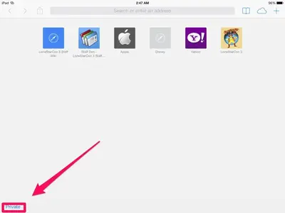
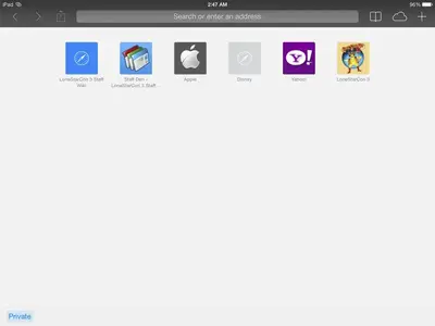
It hasn't disappeared. Clear all your browsing tabs and you'll see the private browsing option at the bottom left of the screen. Tap it and the search bar at the top of the screen turns grey to show you're now on private browsing.Hello Has anyone noticed that the private browsing option has disappeared from Safari, or is it just me ?


Hello
Has anyone noticed that the private browsing option has disappeared from Safari, or is it just me ?
No need to clear all your tabs, just open a new one and you will see Private.....once tapped you will get an option box to clear all tabs or keep all. If you want to get out of private, just tap it again and then tap 'keep all' and it will go back to normal.
jacklothian
iPF Noob
Safari stumps me on the surface no way to navigate I am sure navigation is obvious once you understand the changes but am I interested in investing the time. Maybe I will download another browerHello IpadersTo those who updates their ipads to IOS 7 please give your first impressions and reviews! I wanna know if there is a change in the battery life, I heard it drains quicker with IOS 7, or is it the same! plus an important thing is whether 25pp works just fine with IOS 7 as it does on 6??
kelB
iPF Noob
I have an ipad and an iPhone 5 but chose to test the look and feel on the ipad first. Here are my thoughts in general so far...
Look & Feel
The whole device looks clean, uncluttered yet very bright. I cant help but feel there is depth missing to the icons. It somewhat reminds me of another (unmentioned) operating system. I love and prefer the notification center. I love how its is opaque and you can see the blur of the wallpaper. The calendar that shows up on this drop down menu is perfect for my needs.Its cleaner and more simplistic in design. The control Panel is also a good addition, however and there may be a way but i wish to be able to take of the music part as this is not something I need at hand.
The wallpaper and background. As previously mentioned by others is my biggest gripe is the resizing of the background image. I have some wonderful images and when it zooms in when setting the image it really ruins the whole image. I have tried to resize mages etc but still it only zooms in. Here is hoping this is just a bug that may be fixed in a later update. The icons being opaque and showing colours from the background is also good, something i messed about with for a while to get it just right.
Folders
I love the infinite mound of icons i can group together in 1 folder. Gone are the days of Games 1 and games 2 folders. The simplicity as mentioned above is something that follows through in the design with the folders.
Settings
This is something that hasn't changed too much, i did however have to go thru a lot of them and double check they were set to how i wanted them. I noticed some new ones and had to insure they changed in order to consume battery power.
Photo/camera
I was disappointed that I couldn't find filters within the camera app, this is on my iphone yet not on the camera within ipad. Maybe I'm missing something and i am yet to discover this. Anyone noticed its a lot more clearer on the front facing camera?
Safari
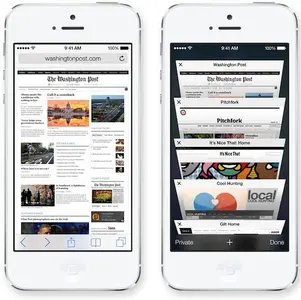
On the iphone it puts tabs like this

I would have liked to have seen this on the ipad also. Just a quirky addition that i like.
Battery
Does it eat battery? or do i just play on it too much. So here is the thing, we get a new iOS and we all try everything out and yes naturally the battery falls quicker.. is it because the iOS is draining or because we are perhaps testing every new feature? Battery power for me went down quick on first day, today despite having Bluetooth on to be typing via a keyboard on this post is not going down so quick. Time will tell once i get back to normal every day usage.
Speed
Increase speed on everything, It might be because i have saved a lot of memory and usage by not installing every app pre update. but it all seems smoother, faster and more sleek whilst navigating and using. However, there is a delay on the keyboard in some case. This is not just on my ipad, i have noticed on my iPhone too. When swapping from letter to numbers the delay can cause me to press a wrong key. There are seconds in it but still quite buggy.
Posts getting a bit long now but overall I like the update. so much so I did update on my iPhone also. Im sure anything i don't like will grow on me, which is good because there is no going back anyways. Any bugs will probably be squished in an update soon anyways. We can hope at least!
Look & Feel
The whole device looks clean, uncluttered yet very bright. I cant help but feel there is depth missing to the icons. It somewhat reminds me of another (unmentioned) operating system. I love and prefer the notification center. I love how its is opaque and you can see the blur of the wallpaper. The calendar that shows up on this drop down menu is perfect for my needs.Its cleaner and more simplistic in design. The control Panel is also a good addition, however and there may be a way but i wish to be able to take of the music part as this is not something I need at hand.
The wallpaper and background. As previously mentioned by others is my biggest gripe is the resizing of the background image. I have some wonderful images and when it zooms in when setting the image it really ruins the whole image. I have tried to resize mages etc but still it only zooms in. Here is hoping this is just a bug that may be fixed in a later update. The icons being opaque and showing colours from the background is also good, something i messed about with for a while to get it just right.
Folders
I love the infinite mound of icons i can group together in 1 folder. Gone are the days of Games 1 and games 2 folders. The simplicity as mentioned above is something that follows through in the design with the folders.
Settings
This is something that hasn't changed too much, i did however have to go thru a lot of them and double check they were set to how i wanted them. I noticed some new ones and had to insure they changed in order to consume battery power.
Photo/camera
I was disappointed that I couldn't find filters within the camera app, this is on my iphone yet not on the camera within ipad. Maybe I'm missing something and i am yet to discover this. Anyone noticed its a lot more clearer on the front facing camera?
Safari
On the iphone it puts tabs like this

I would have liked to have seen this on the ipad also. Just a quirky addition that i like.
Battery
Does it eat battery? or do i just play on it too much. So here is the thing, we get a new iOS and we all try everything out and yes naturally the battery falls quicker.. is it because the iOS is draining or because we are perhaps testing every new feature? Battery power for me went down quick on first day, today despite having Bluetooth on to be typing via a keyboard on this post is not going down so quick. Time will tell once i get back to normal every day usage.
Speed
Increase speed on everything, It might be because i have saved a lot of memory and usage by not installing every app pre update. but it all seems smoother, faster and more sleek whilst navigating and using. However, there is a delay on the keyboard in some case. This is not just on my ipad, i have noticed on my iPhone too. When swapping from letter to numbers the delay can cause me to press a wrong key. There are seconds in it but still quite buggy.
Posts getting a bit long now but overall I like the update. so much so I did update on my iPhone also. Im sure anything i don't like will grow on me, which is good because there is no going back anyways. Any bugs will probably be squished in an update soon anyways. We can hope at least!
Many thanks, will have to study a bit harder next timeIt hasn't disappeared. Clear all your browsing tabs and you'll see the private browsing option at the bottom left of the screen. Tap it and the search bar at the top of the screen turns grey to show you're now on private browsing. <img src="http://www.ipadforums.net/attachment.php?attachmentid=48240"/> <img src="http://www.ipadforums.net/attachment.php?attachmentid=48241"/>
No need to clear all your tabs, just open a new one and you will see Private.....once tapped you will get an option box to clear all tabs or keep all. If you want to get out of private, just tap it again and then tap 'keep all' and it will go back to normal.
Many thanks.
Many thanks, will have to study a bit harder next time
I like it when folks ask questions - helps us learn the new stuff about this iOS.
Great fun, actually, digging around to see what's changed, different or new.
Marilyn
For me, my only gripe right now is the fact that my wallpapers no longer fit correctly.
the same problem i have.
Have a similar problem where my BTinternet.com web page appears too big and blocks off the delete/spam buttons on the bottom of the screen, maybe my provider needs to upgrade to IOS 7.the same problem i have.
