First of all, phones do not go landscape on the home screen or the lock screen, so you only need to worry about one orientation. For the iPad, it goes both ways so your wallpaper must compensate and look good both ways, and that is HARD.

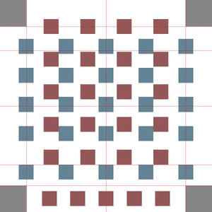
This is what i use to crop my wallpapers, immediately you see the 4 squares on the corners, those are the parts you never see when used as wallpapers. So obviously you cannot have any features in those squares.
Next you'll see the cyan guide lines, there are the border lines, two center lines, and two for the UI element on landscape lockscreen. portrait lockscreen's UI goes exactly to the landscape border. You cannot have any primary image elements in those areas because then it gets blocked in the lockscreen, or is invisible in either landscape or portrait.
Lastly you'll see the blue and red icons, those are where the icons will be. If you have key elements like faces or logos you can't have them there or they'll get blocked. And it's not like in Android where you can move the icons around.
All that already make a good wallpaper extremely hard to find, but there are still two more problems that can be easily addressed in software. First is that iOS automatically applies a black gradient on the bottom, to make the dock stand out I guess. This makes some wallpapers not suitable because their bottom part is supposed to be bright, looks bad with black on top. The second is you cannot have custom frame for landscape and portrait. What I mean is they both go in the center, you can't have only the top portion as landscape, and right portion as portrait. if you try it it crops your image smaller so the other orientation fits inside your current one. I know having separate wallpapers increases memory use, but having custom frames doesn't, at least just a few lines of code more. I think we should have that at least, and the option to not darken the bottom half.
Other than that, you can't have full black because the screen only goes about 1000:1, it's not AMOLED so pure black doesn't look very good. It can't be too complicated cuz it distracts and you can't see the icons. It can't be explicit, obviously, cuz it's too big with wide angle display and you don't want others to see it. Can't be anything other than exactly 1024 pixels in at least one edge or it will become blurry. last but not least, the color scheme has to match that of IOS, and my app icons on the first page.
Of course abstract papers do fine because they are just patterns and don't really have a focus. But to be honest, 99% of those are crap, they are colorful and flashy, but have no aesthetics. All the default ones are awesome, of course.
I enjoy all kinds of arts, whether it's a painting, vector, photography. But for now I have a collection of anime images, just for wallpapers for my PC, my phone, and now my iPad. The collection has 42,000 images, I can't say I know all of them but i recognize most of them, I flipped through a lot of it. And so far, I've only been able to come up with 58 wallpapers. out of which I think 3 are great, and 10 are good. The rest generally have framing and color problems. what a pain.
But is it worth it? of course. When you get the perfect wallpaper it just makes the iPad that much better.
Last edited:


