You are using an out of date browser. It may not display this or other websites correctly.
You should upgrade or use an alternative browser.
You should upgrade or use an alternative browser.
Safari icons
- Thread starter LannyC
- Start date
twerppoet
iPad Fan
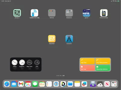
Do you mean the ones yiu get when you swipe all the way to the left, where the screen blurs and you have nothing but widgets?
If so, you were probably using old widgets from a few years back. Support for them has been discontinued.
Long press on the screen, then select the (+) button at the top left. With a little luck you'll find a newer widget that will be close enough for what you want.
Keep in mind that you can now add widgets to any screen, and place them pretty much anywhere on the screen. You may prefer that if you give it a try. It's still kind of finicky to arrainge.
Attachments
LannyC
iPad Fan
No, not widgets on my Home screen. I set my Safari default start page to show my Favorites bookmarks. They are now about 1/4 their former size (half as wide, half as tall). I can’t find a pref to reverse this silly default.
Lately, Apple seems to include more useless “features” and fewer user choices with each release. I guess by this point I should have learned to just stop updating.
Lately, Apple seems to include more useless “features” and fewer user choices with each release. I guess by this point I should have learned to just stop updating.
Aerofly
iPad Fan
I noticed that when I first updated my iPad Pro to iPadOS 18 my default ‘start page’ favourites icons didn’t load properly and all I got were ‘grey squares’ that looked like placemarks.
However after leaving them like that for a while (can’t quite remember how long it took) they all suddenly appeared as normal icons again.
However after leaving them like that for a while (can’t quite remember how long it took) they all suddenly appeared as normal icons again.
twerppoet
iPad Fan
Tap on Edit, and turn Suggestions back on. This was the second row of icons you mentioned. Besides being able to turn the five sections on/off, you can also drag them into whatever order you like.
Warning, they no longer look like icons. Instead you've got some tiles. They take some getting used to, but they do offer more information.
If what you are missing really was in Favorites, your Safari Favorites folder may have changed. You can change that in Settings > Apps > Safari > General > Favorites.
The Favorites folder is part of your Bookmarks, and can be customized by going to the folder in the sidebar and choosing Edit at the bottom.
Aerofly
iPad Fan
I do agree it would have been nice to be able to make the icons larger. Perhaps they could have included it as an option as part of the Accessibility options……..we’ll probably never know the real reason.
Last edited:
Similar threads
- Replies
- 3
- Views
- 2K

