What's new

iOS 7 is now available for download

Got it, thanks. Don't like the auto-fill function there, but I live, thanks again for the help, still hate the 'upgrade'.

No problem.

I recommend giving the upgrade a couple of weeks before you set your hate in stone. There is a lot to love tucked away, and little thing like the look and changes in how things are done fade away quickly with use.

As far as looks, I've found that finding a good wallpaper is critical. With all the translucency and auto-colored folder icons the background has a huge impact on how things look.
 
Interesting point. I actually like the changes. Big fan of iPad anyway. Use it in preference to desktop or smartphone. Probably move to iPhone when my contract is due for renewal in January.

I tested in your comment about a good wallpaper. Could you expand on that please sounds like good advice. Thanks
 
Upgrade went well. I don't hate the upgrade but I don't understand why they had to change things that didn't need changing. The appearance of the screen is annoying. I will get used to it.
 
. . .Could you expand on that please sounds like good advice. Thanks

Sure, though you shouldn't expect too much. I just went to a website that offered a lot of iPad wallpapers free, and downloaded (a lot of) the ones I liked. Then I spent about half an hour experimenting.

First, overall color is important. this is going to affect the background color of the folders. They will usually be lighter than the median color of the wallpaper. Sometimes this looks nice. Other times it looks bland. In the worst case the folder background will blend in with portions of the wallpaper, leaving you with a group of tiny icons to look for.

Which is why I ended up with a fairly uniform color and gradient in the wallpaper I chose. But I am also biased towards non- distracting patterns. Something that is pleasing to the eye, but quickly fades from awareness. I also tend to dark colors, especially blue or black, but that is only personal preferences, I'm sure.

Another thing to hold in mind is the new parallax effect. This moves the picture behind the icons as you tilt the iPad, creating the illusion that the icons are slightly raised from the background. To achieve this the wallpaper picture must be slightly zoomed in, so there is space around the edges to accommodate the movement. Wallpapers for iOS 6 and before don't take this into account. When you pick one be aware that there will be cropping.

Another of the results of the parallax effect is that the iPas (apparently) has to do some major computing on the wallpaper ahead of time to make it smooth and responsive. On my iPad 3 this makes for an unresponsive setup. The wallpaper takes too much time to load the preview, then it lags when zooming or positioning the preview, and finally, when you tap a button to apply it sits there like a child (or my dog) pretending it did not hear you; just to make sure you know it will do things when it is darn well ready.

But this is one of the few places I've noticed lag issues, and it is not used often (by me), so I can live with it.

In the end my recommendation is to do what I did. Load up on potential wallpapers, then when you have some spare time, experiment.

Here is what I'm using for now.
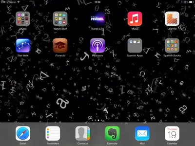
image-2509876772.webp
 
Download ands complete install took just over 1 hour start to finish on this iPad2. I don't like the white appearance as much in safari, but safari now downloads pictures much faster in 7 than in 6. I can live with the plain appearance since the functionality of the unit is improved.

Overall, I'm happy.
 
Know its a cheek but was there a decent site you went to that was safe etc: Not much of a techie. Silver surfer actually. Dont want to download anything that will give me problems. Appreciate any advice at all of where to go. Seem quite a lot on the iPad App Store. Assume they are all safe. Sorry sound a bit of a nerd but not really up on a lot of the technical stuff.
 
Lots of adds, but plenty of free wallpaper. I don't usually bother to save a wallpaper site, there are so many, but I thought I might go back to this one.

iPad Wallpapers And Backgrounds

I used Safari on the iPad. Once you've downloaded the image (see it on it's own tab) just tap and hold for the Save option.
 
Made the same mistake but you can turn that feature off in settings.

I made this mistake too. I want to turn pass code off. You say it can be done in Settings? I looked there, but can't find out where or
how to turn it off.

Must say, my download was pretty quick, no problems at all
 
I made this mistake too. I want to turn pass code off. You say it can be done in Settings? I looked there, but can't find out where or
how to turn it off.

Must say, my download was pretty quick, no problems at all

Just found the screen shot posted earlier. Thanks. Don't know how I missed it
 
Still ok with the update but I notice that in some spots the print does not seem as clear, rather it's grayed, readable but not as clear and crisp as usual. I know I'm old and my eyesight is on a downward trajectory but an overnight change post iOS 7? Guess I'll adjust but I wish those young whippersnappers at apple would think of we old ladies when making their pretty pale new look.

Bobbi
 
I tried to use the link to check it out before I downloaded it, but it wouldn't work unless I had IOS 7 already installed - pretty DUH of Apple! When I did download it to the phone and iPad, it took a LOT longer than the " about 5 minutes left" that the screen said, and I hated it so much on the phone, I instructed the iPad NOT to restart and install it - then when I went to bed, it did it anyway overnight! So now I have it on both my devices and I HATE IT!
 
Still ok with the update but I notice that in some spots the print does not seem as clear, rather it's grayed, readable but not as clear and crisp as usual. I know I'm old and my eyesight is on a downward trajectory but an overnight change post iOS 7? Guess I'll adjust but I wish those young whippersnappers at apple would think of we old ladies when making their pretty pale new look.

Bobbi

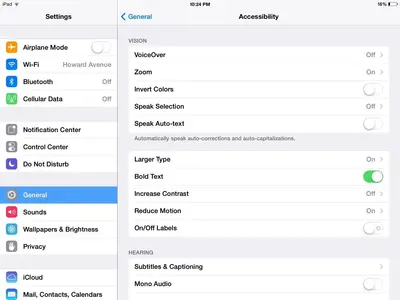
If I may suggest - look in the Accessibility section of your Settings tab for the line "Bold Text." If you turn it ON, you may find the print is a bit darker and easier to read. Well, at least I did:

ImageUploadedByTapatalk1379643952.849915.webp

If you've already done, then sorry, but I've got nothing else. Cause, it is a lighter font... :)

Marilyn
 
Still ok with the update but I notice that in some spots the print does not seem as clear, rather it's grayed, readable but not as clear and crisp as usual. I know I'm old and my eyesight is on a downward trajectory but an overnight change post iOS 7? Guess I'll adjust but I wish those young whippersnappers at apple would think of we old ladies when making their pretty pale new look.

Bobbi


Every iOS version has added a bit more to the Accessibility options. iOS 7 is not exception. Some of the below is new, some of it just works a bit better.

Go to Settings > General > Accessibility and turn on Bold Text. Your iPad will reboot and almost all the system fonts will be thicker and more readable.

You can also play with the Larger Type settings in the same place. It only affects Mail, Contacts, Notes, and some parts of Calendar for now.

The Larger Dynamic Type switch is for third party apps. If the developer supports it then switching this on will result in larger type in that app. I don't know if anyone is supporting it yet, but it's probably worth a try.


Hope this helps
 
Just downloaded the IOS 7 on my ipad mini. This is generally a welcome upgrade. However, there is a problem on some of my application. For My Photos, for example, I can access the keyboard to type my password to open the app, however, when the individual locked folders ask for the password, the keyboard fails to open! I tried using an external Bluetooth keyboard, and I can't still my type my passwords!
 

Most reactions

Latest posts

Back
Top